
Oral Radiology Experts
Optimizing B2B site with strategic CTAs and information hierarchy, leading consultation bookings 400% faster than original site.
Project Goals

Help B2B website resolve pain points and boost conversions
Improve usability and navigation on hero page for site visitors
Streamline the process for clients to book a consultation
Case Study Navigation
Click on any button to jump to a section.
Research & Discovery
Initial Client Interview
I began this project by interviewing the business owner to understand their goals for redesign. She wanted to refresh the design and emphasized a focus on improving CTAs to help generate more booked consultations and engagement with her brand.
Competitive Analysis
To kick off the project I researched Oral Radiology Experts’ top 3 competitors.
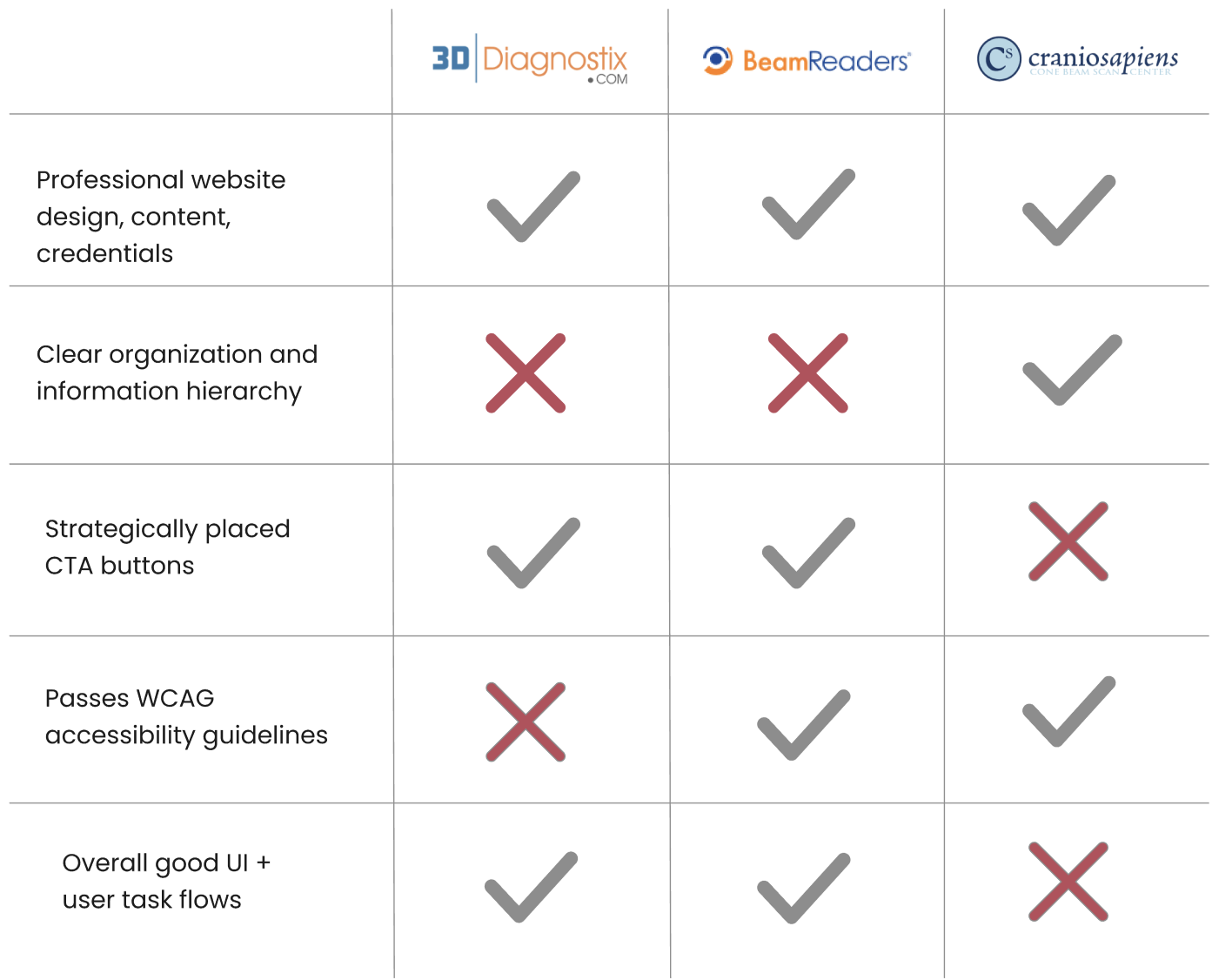
Competitors lacked information hierarchy, making sites hard to navigate
CTA buttons used strategically to help grab potential clients’ attention
2/3 of the competitors followed WCAG accessibility guidelines
Gathering User Requirements
Quickly Understand Available Services Users need a clear list of imaging and reporting services with brief, plain-language explanations.

Book or Request a Consultation Easily - Users need a prominent call-to-action to schedule a consultation through a short, guided form.
View Transparent Pricing- Users need to easily find current pricing and understand which scenarios each price tier applies to.
Navigate the Site with Ease- Users need clear navigation and logical page structure so they can find services, pricing, and contact information quickly.
Lo-Fi Prototyping
Wireframes

Here are some of the rough wireframes I created review with the primary stakeholder to ensure the updated design would match their vision before proceeding with hi-fi.
Hi-Fi Prototyping
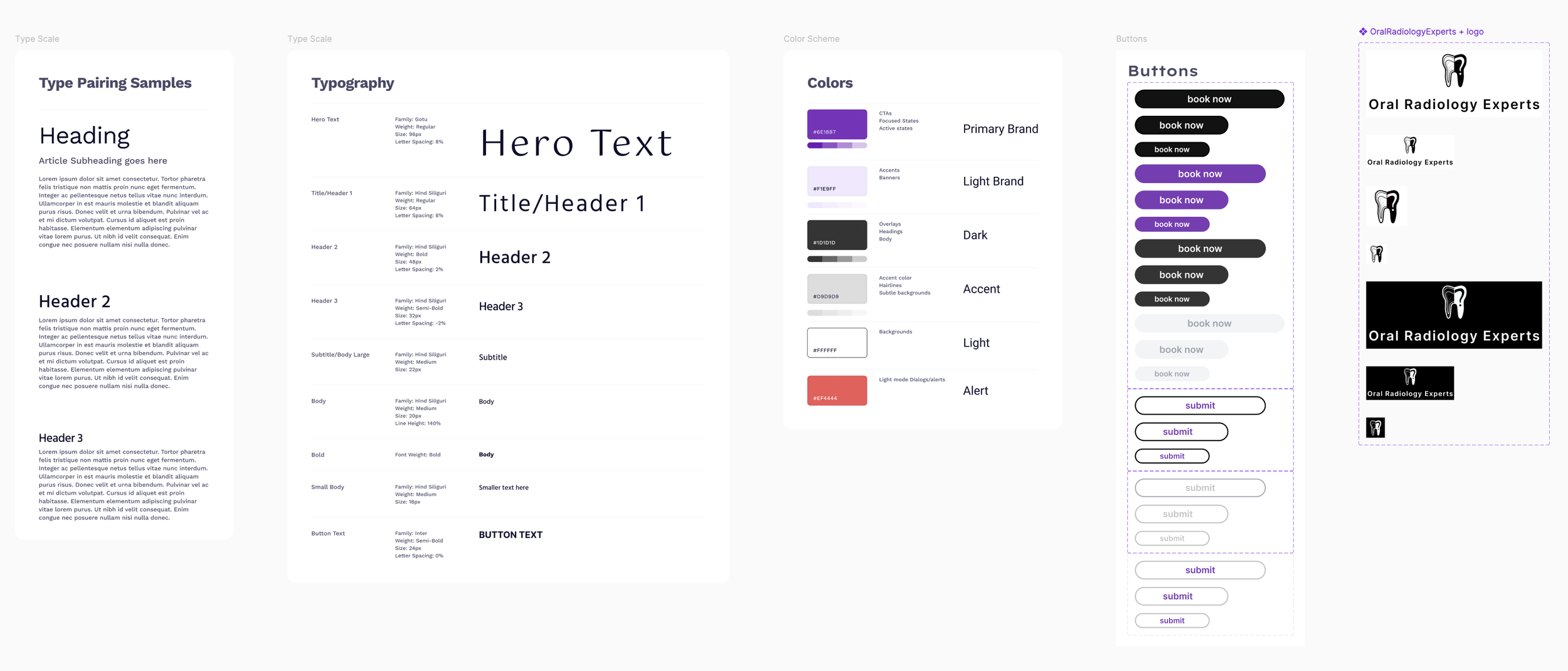
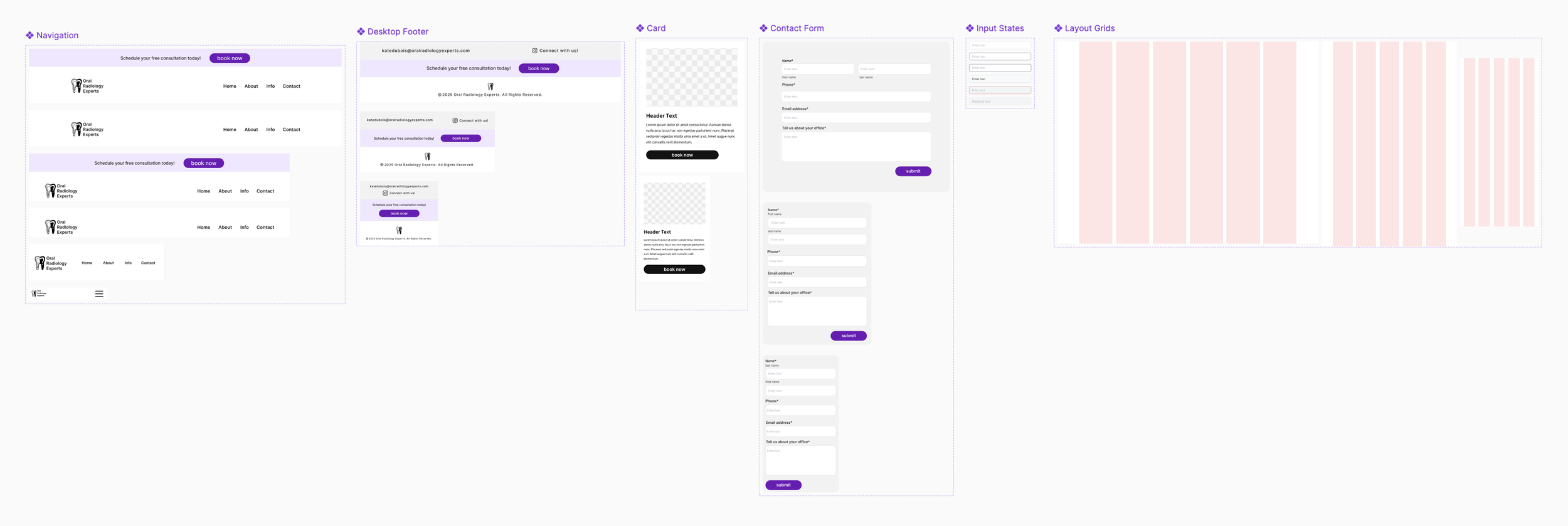
Design System & Style Guide
I think of design systems as the backbone of scalable, high-quality product design. It creates a shared language between designers, developers, and stakeholders, ensuring that components, patterns, and behaviors are consistent across experiences. This consistency speeds up design and development, while reducing errors, improving accessibility, and making future iterations easier to maintain.
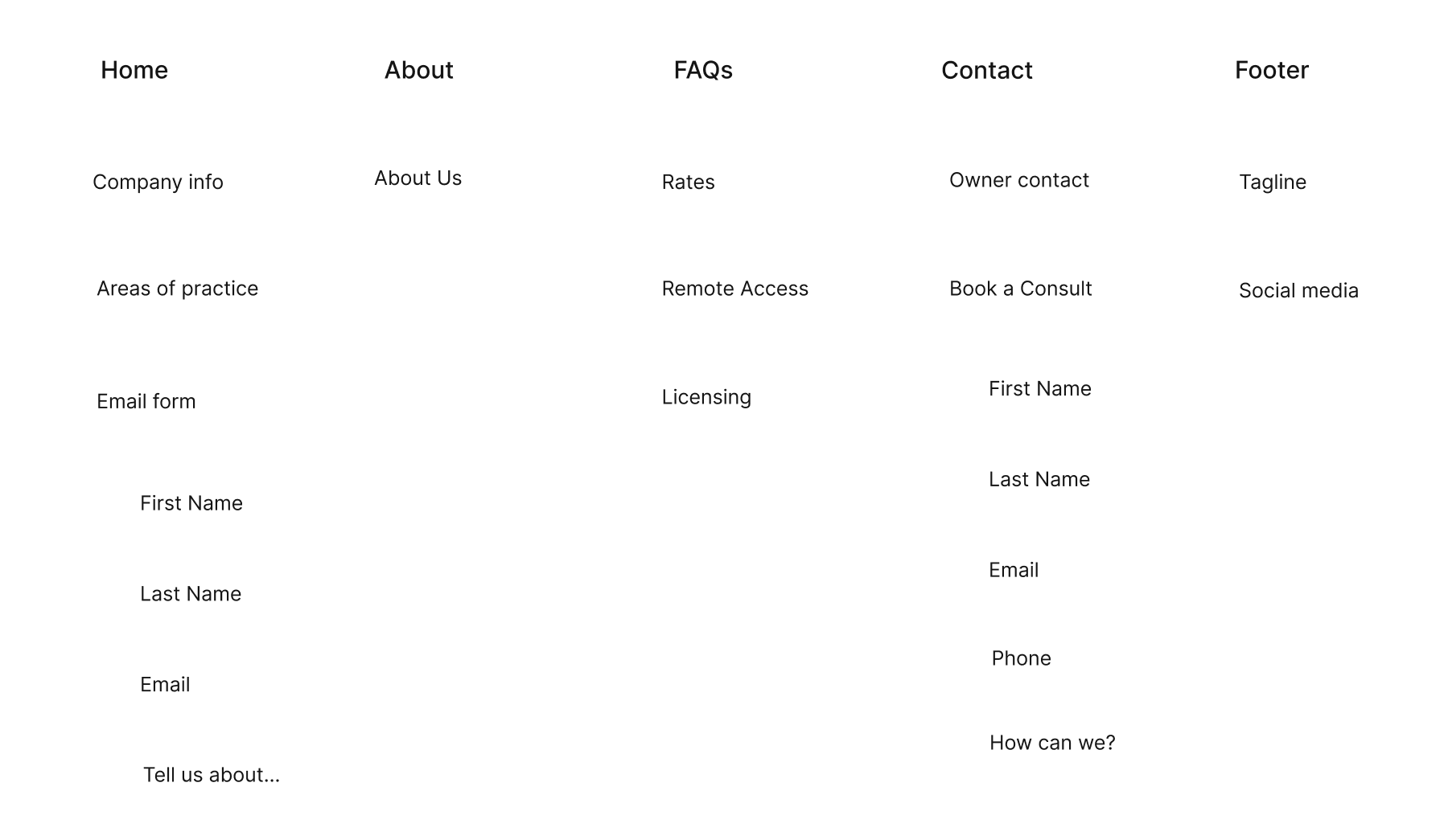
Information Architecture
I compared the information architecture of the old website and the prototype. It served as a valuable resource for the owner to be able to compare and contrast the changes that were made to improve the flow of the site.
Old Site Information Architecture
Prototype Information Architecture
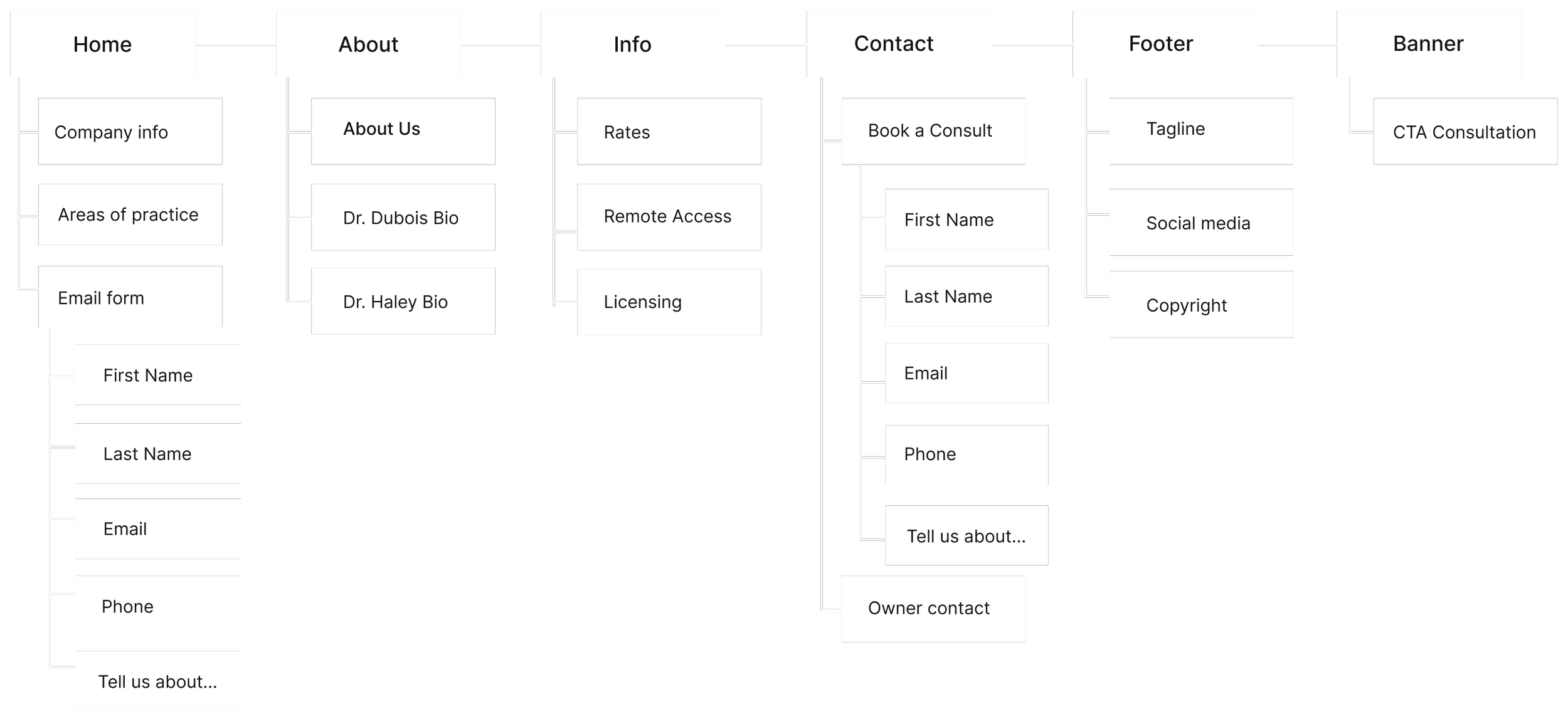
Old Site vs. Prototype
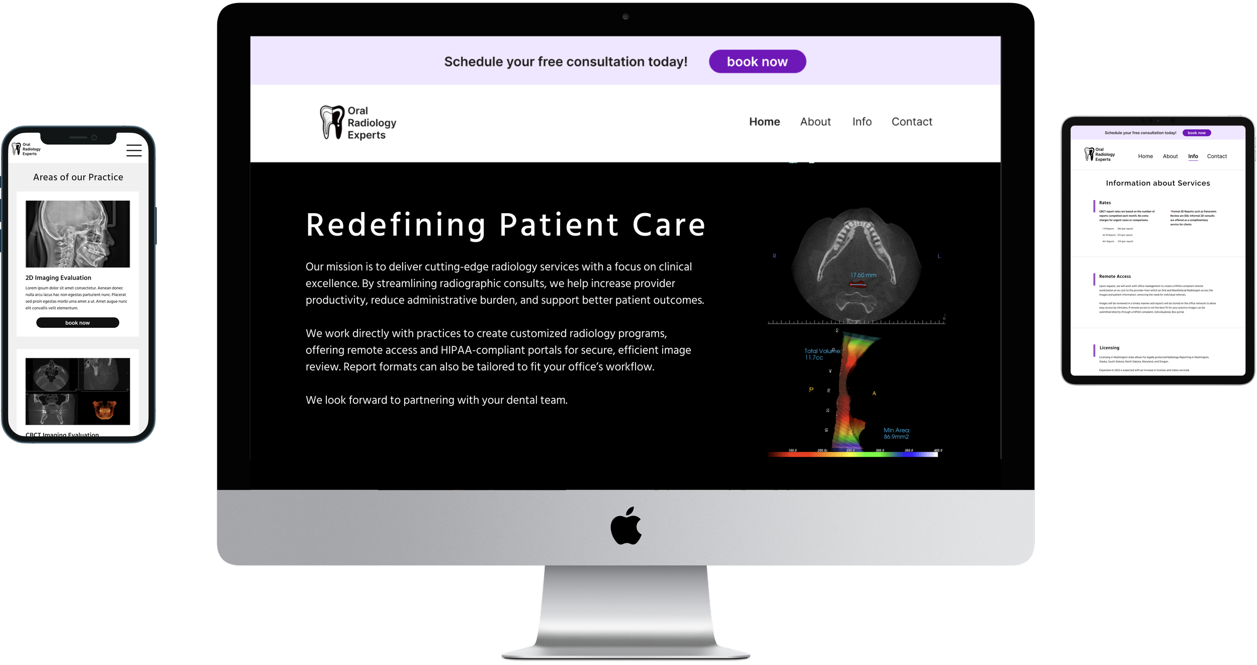
Hero Page Section Redesign
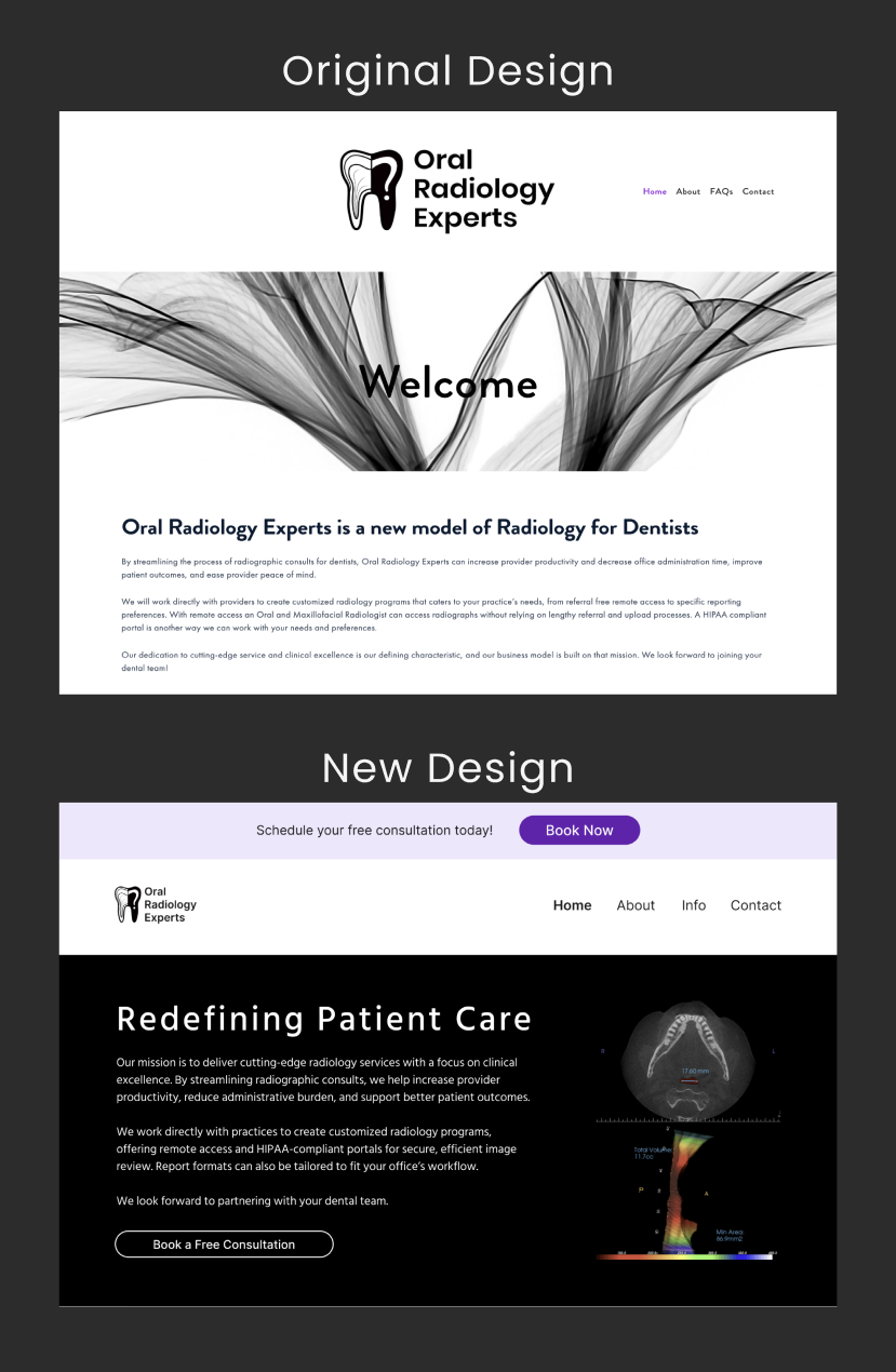
Problem: Brand presence felt inconsistent and dated, and the hero relied on generic “Welcome” messaging with no clear value proposition.
Solution: Introduced a strong, benefit-driven headline (“Redefining Patient Care”) and applied a modern color palette, consistent spacing, and cohesive layout to create a polished, professional brand presence.
Problem: No primary call-to-action was visible above the fold.
Solution: Added a prominent “Book a Free Consultation” CTA in both the top utility bar and hero to drive conversions.
Problem: Abstract hero imagery did not communicate radiology or clinical context.
Solution: Replaced abstract imagery with diagnostic visuals that better reflect services and build credibility.
Problem: Content felt dense and difficult to scan.
Solution: Reworked typography hierarchy and spacing to improve readability and content prioritization.
Problem: No visual emphasis on business goals (consultations).
Solution: Elevated consultation messaging with a persistent top banner and repeated CTAs to support conversion-focused behavior.
Contact Section Redesign
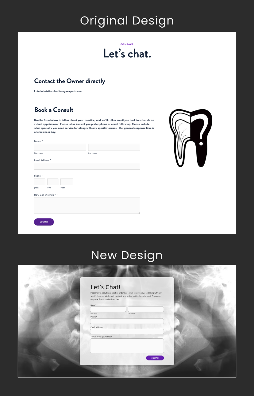
Problem: “Contact” header appeared like a clickable CTA due to purple styling.
Solution: Updated header styling to clearly distinguish it from actionable elements.
Problem: Oversized tooth logo distracted from the form.
Solution: Removed the logo to keep visual focus on form completion.
Problem: Text sizes did not meet ADA accessibility guidelines.
Solution: Increased font sizes to improve readability and accessibility.
Problem: Layout felt misaligned and cluttered, reducing trust.
Solution: Streamlined content and improved alignment for a cleaner, more professional presentation.
Problem: Users received no feedback after submitting the form.
Solution: Added a confirmation message to reassure users their message was successfully sent.
User Testing
I conducted a mixed-methods study focused on usability, discoverability, and accessibility. Part one gathered quantitative insights through time-on-task A/B testing, while part two captured qualitative feedback using preference testing and a think-aloud protocol.
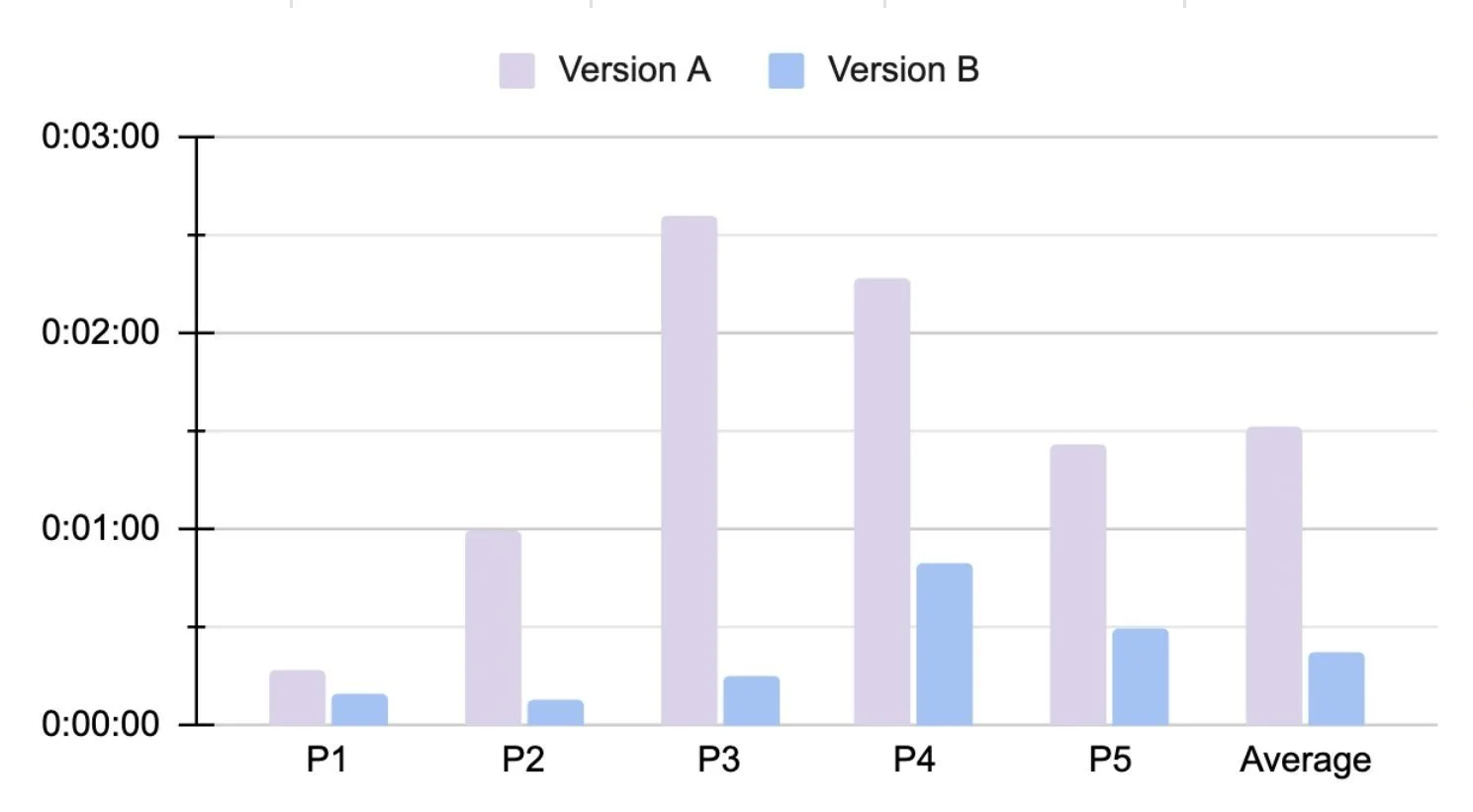
Part 1: A/B Testing: Time on Tasks
Participants were presented with a scenario followed by tasks, each timed separately. Time on task was used as an evaluation method to provide stakeholders with concrete metrics around site navigability and efficiency.
Task 1: Learn about services and find pricing
Version A (old website): Ideal Path: Home > FAQs > Rates/Licensing
Version B (updated website) : Ideal Path: Home > Info
Results:
Average of Version A was 00:02:28s, average of Version B task time cut down to 00:01:30s
Task time cut down by almost 50%
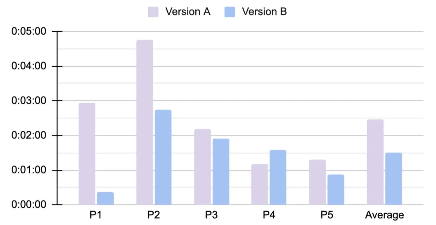
Task 2: Book a consultation
Version A (old website): Ideal Path: Home > Contact Page > submit form
Version B (Updated website): Ideal Path: Home > CTA banner > submit form
Results:
Time to accomplish Task 2 VB was significantly cut down, by 140.4%
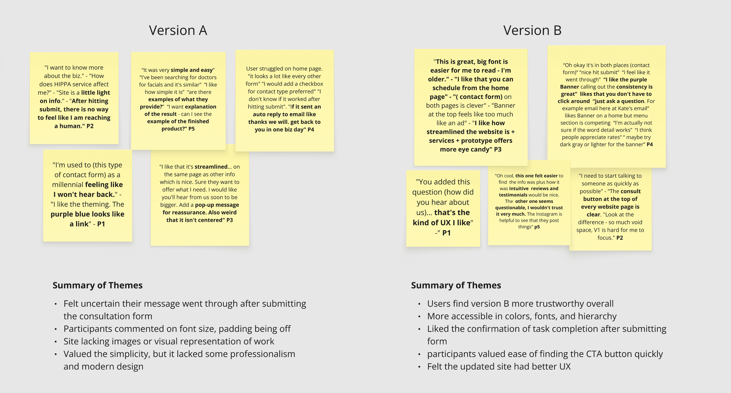
Part 2: Preference Testing (Think Aloud Method)
Five participants were asked to reflect on the previous tasks while freely navigating the website and prototype. Think-aloud responses were organized using thematic analysis, and the resulting data was analyzed upon completion of the walkthroughs.
Design Handoff
After completing testing and evaluation, I shared key insights with the business owner and aligned on moving the design forward to implementation. I communicated to the developer that the design system was built to support cross-functional collaboration and follows industry-standard conventions. Linked below is the developer-adapted version of the final prototype.
Key Takeaways & Recommendations
Updated Design Is More Trustworthy
A/B testing showed that users felt more confident in Version B, describing it as more trustworthy, established, and credible.
1.
Opportunity for Broader Industry Validation
While one participant worked in the dental industry, future testing should include more prospective users (practice owners, receptionists, and office managers) to gather deeper, role-specific insights.
2.
Reduced Cognitive Load & Faster Information Retrieval
The Figma prototype improved scannability and information hierarchy, enabling users to find what they needed more quickly.
3.
Strong Overall Design Preference
Users preferred the new design and noted a positive impact from the updated UI and UX elements.
5.
Improved Handoff Learnings
Comparing the prototype to the implemented version revealed opportunities to refine my handoff process and better support design fidelity in future projects.
4.
Thanks for Reading