
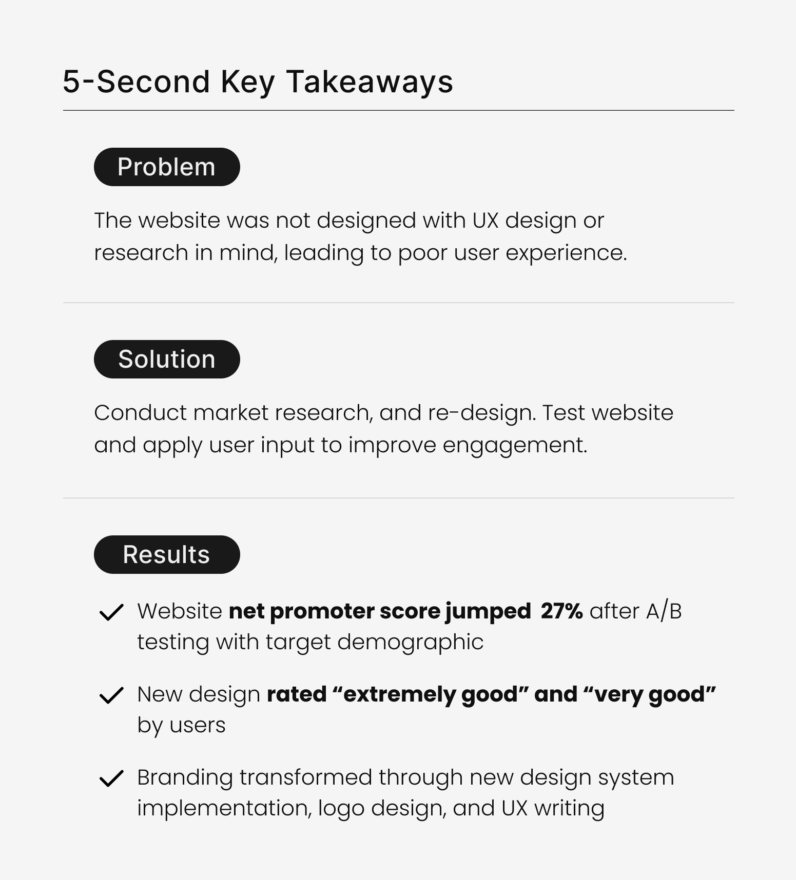
27% jump in net promoter score with new design
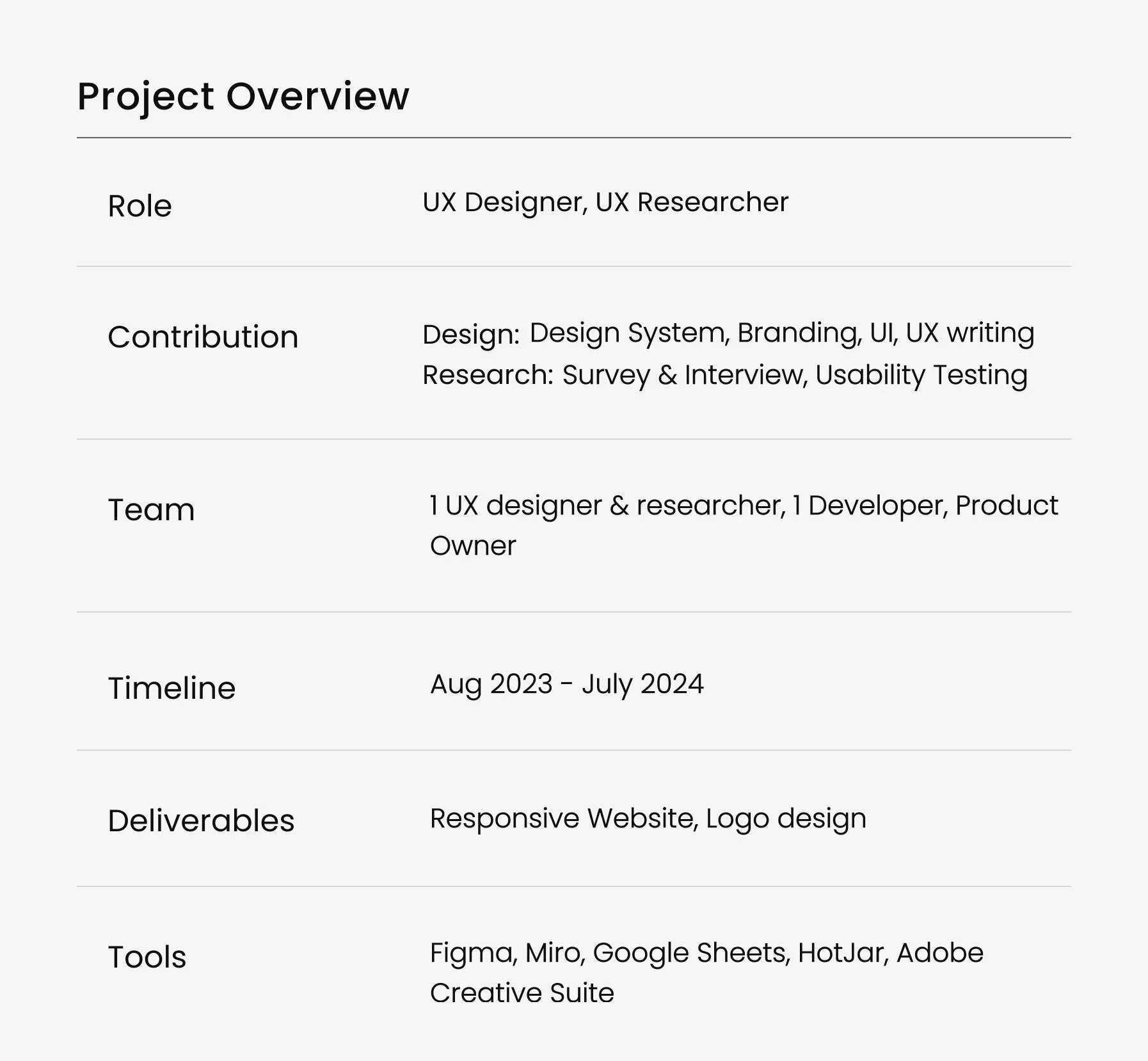
Project Goals
Strategize CTA buttons to stream podcast on audio apps
Research user needs to improve design to drive engagement

Build user trust and community with UX writing and linked socials
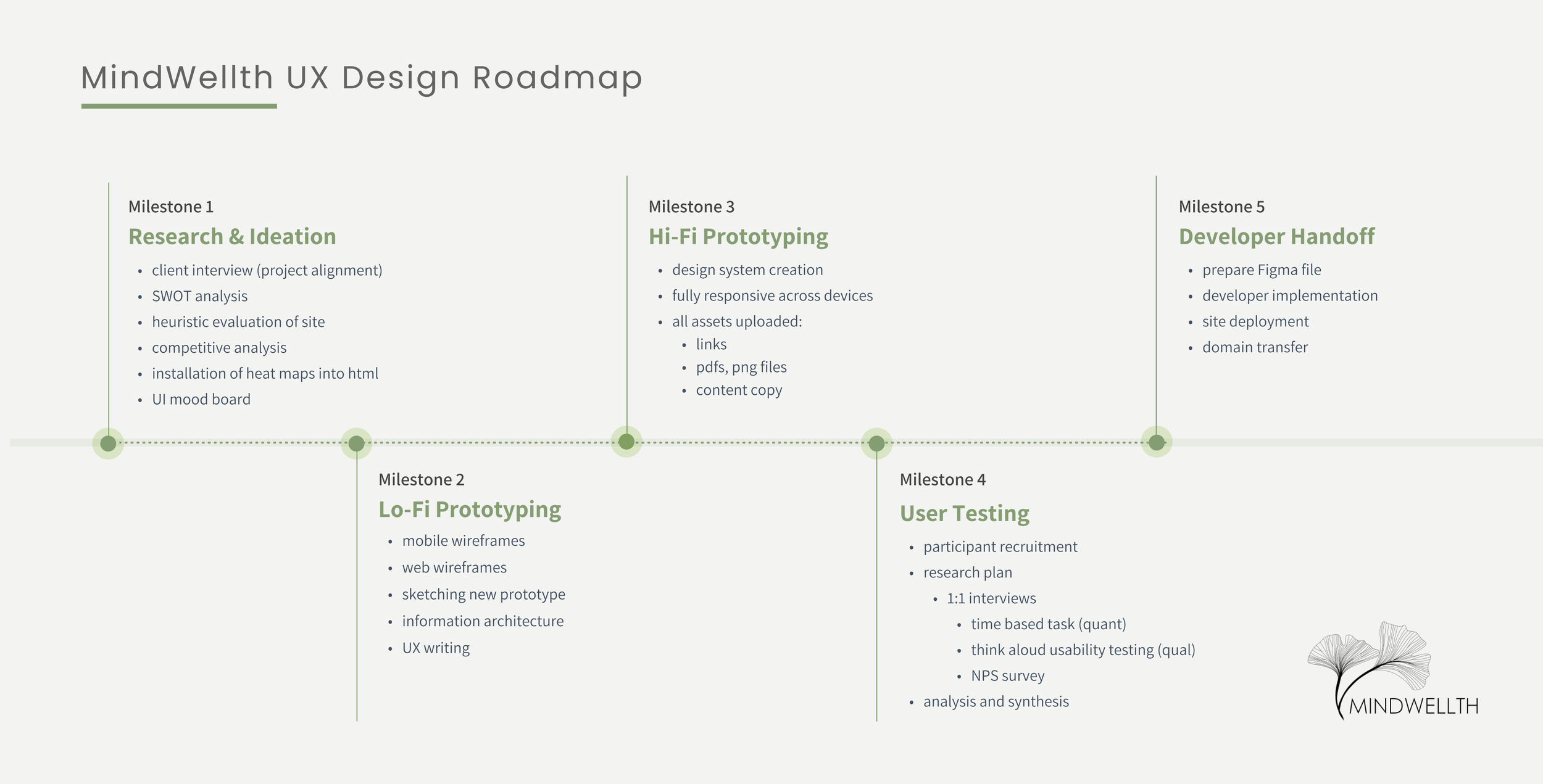
Project Roadmap
Click on any button to jump to specific section.
Research & Discovery
Whenever I kick off a new project, I always make sure I fully understand the business owners’ key goals, what they want to explore, and consider how I can help improve the UX and CX across the user journey.
Initial Client Interview
I kicked off the project with an interview to ensure client vision and project alignment.
They communicated goals for the updated website were:
Boosted sales - make shopping intuitive
Podcast CTA buttons - link podcast strategically
Gain listener trust - reinforce personality to build credibility & trust
Linking social media - position links to generate traffic
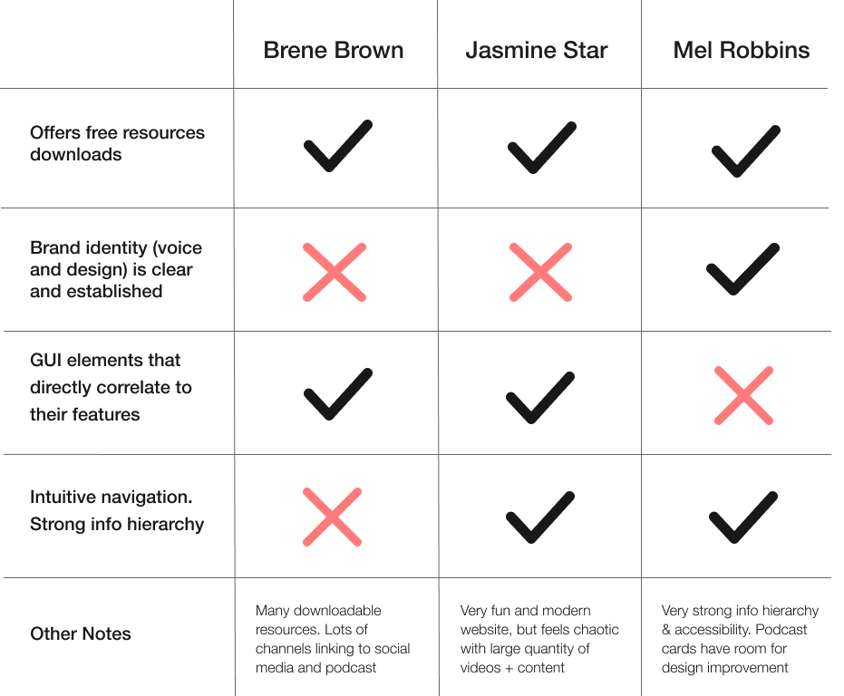
Competitive Landscape
I utilized a competitive analysis with the top podcasts in the same field of science-backed wellness.
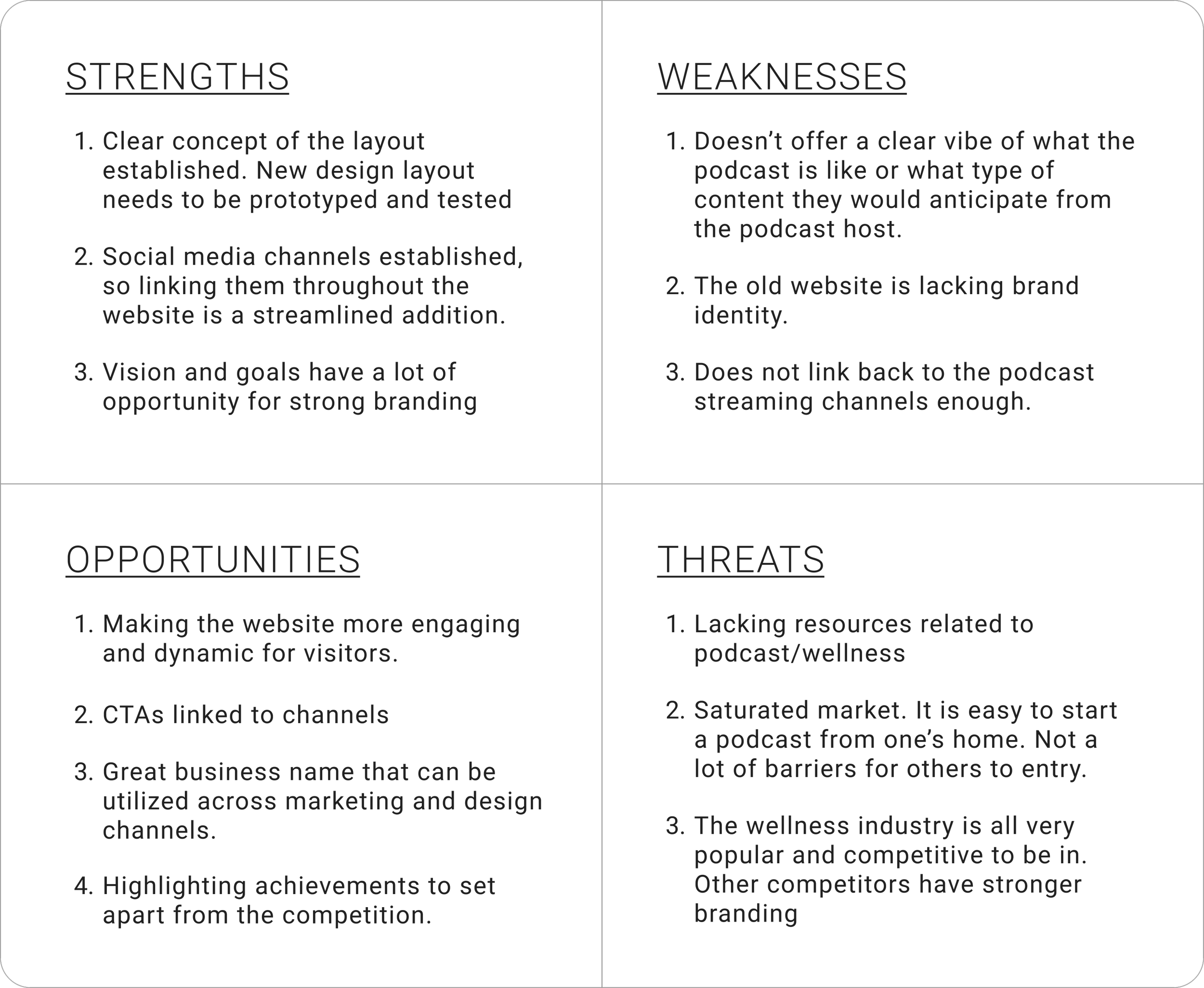
SWOT Analysis
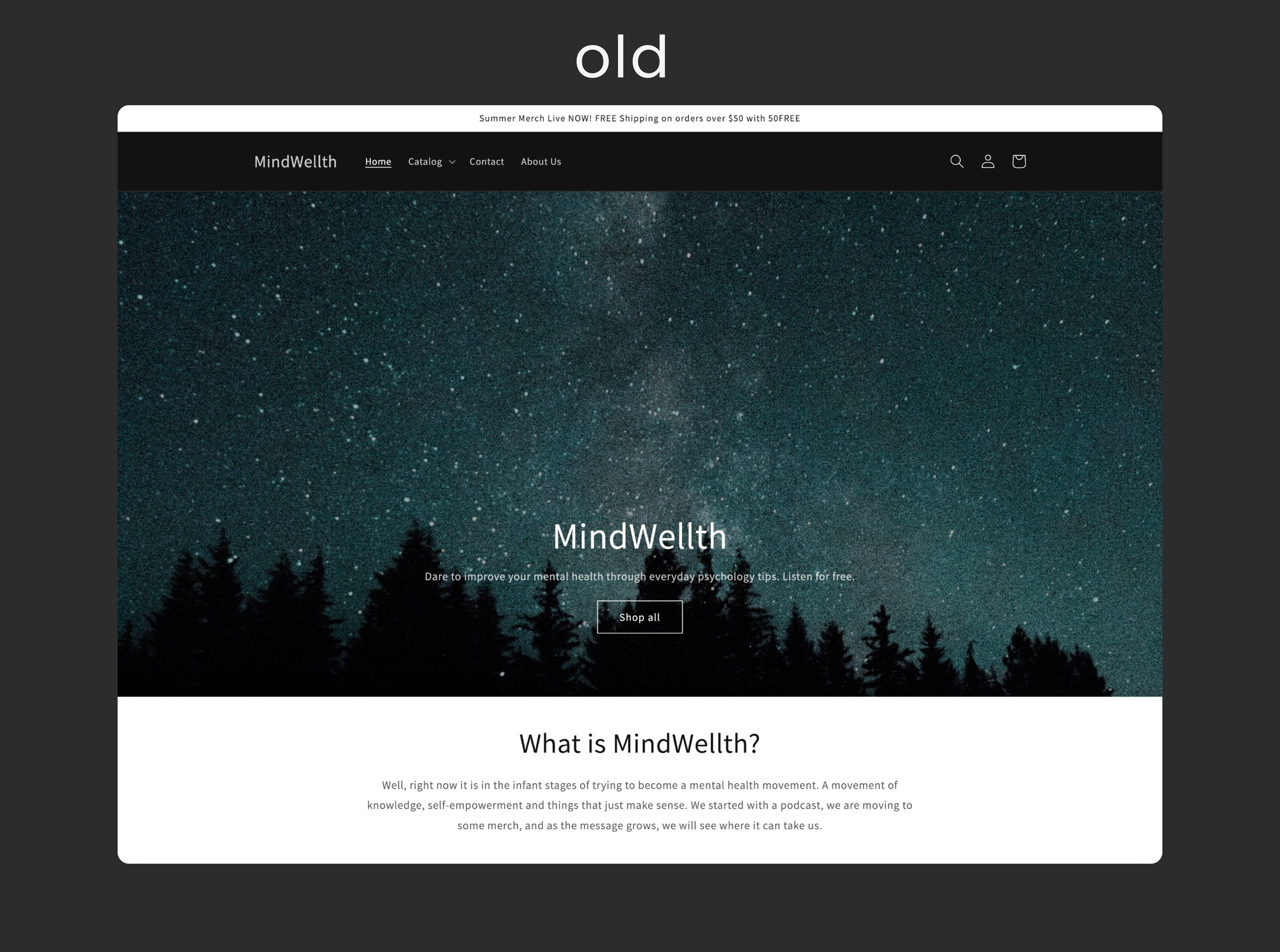
To help holistically identify problems areas and inform next steps the design process, I evaluated the state of the (old) website and brand in relation to her business goals shared during the interview.
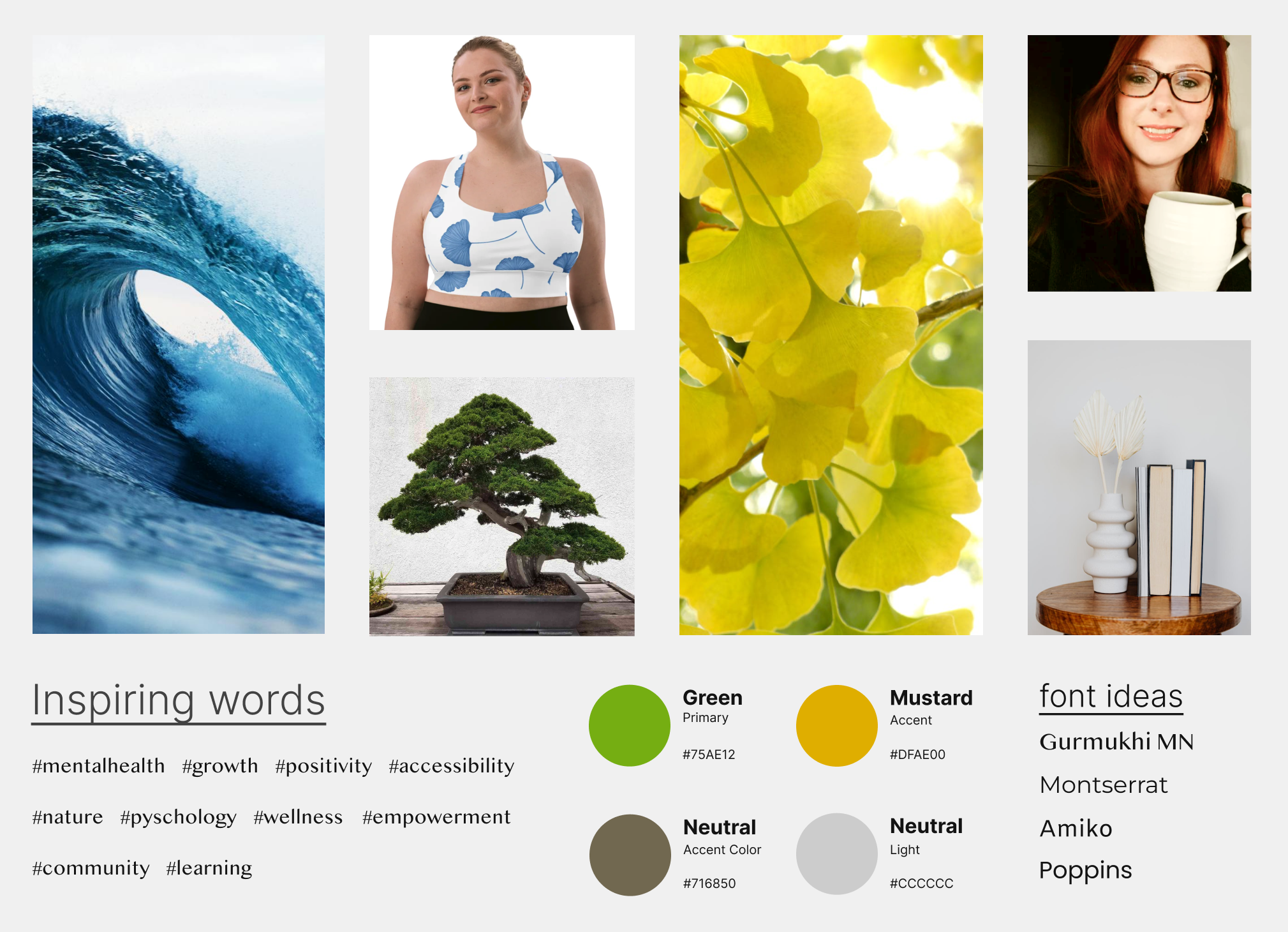
Client Check-In with Mood board
I presented the client with a mood board based on findings from the competitor analysis, heuristic analysis, and initial client goals. I find mood boards to be an efficient tool to ensure UI vision alignment.
Heatmapping via HotJar
I installed html heat-mapping data collection software, HotJar, across Mindwellths’ web pages to help collect user data. The goal of the installation was to understand user behaviors: scrolling, hovering, clicking, and bounce rates.
Analyzing Home Page Data
Analyzing - About Page Heat map Data
Feedback Button via HotJar
A button was installed into the website html for qualitative data collection, helping to automate customer feedback.
Lo-Fi Prototyping
I drafted up these wireframes in Figma, showing the client how I could boost their existing content and add more credibility features to help build trust. Examples include customer reviews for social proof, a more personal about page, CTA buttons, and a downloadable resource guide.
= changes made in prototype
Hi-Fi Prototyping
I created the prototype in Figma referencing a design system. Additional changes were made as well after testing the hi-fi prototype.
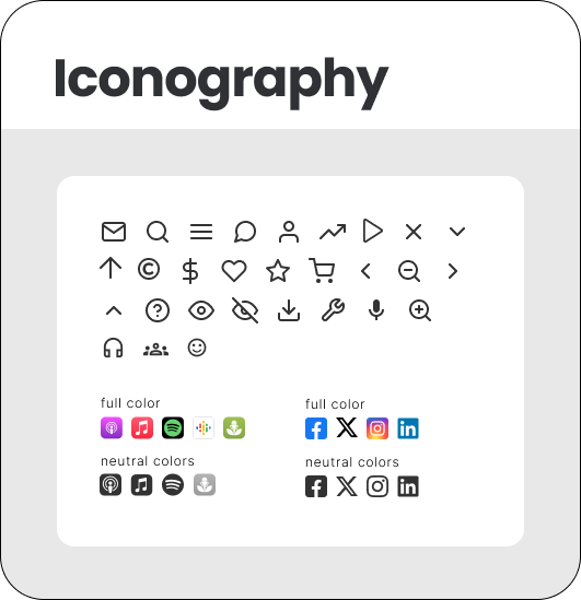
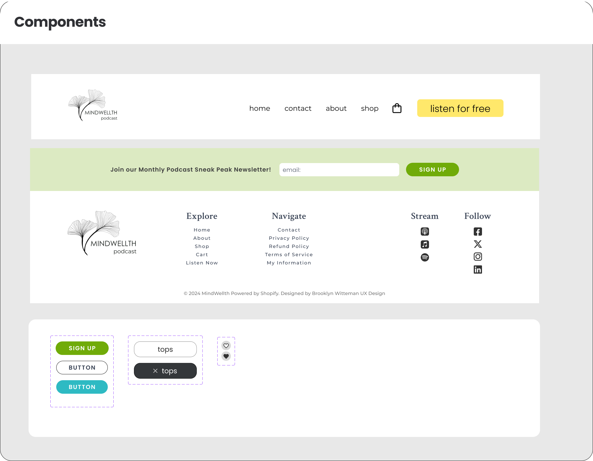
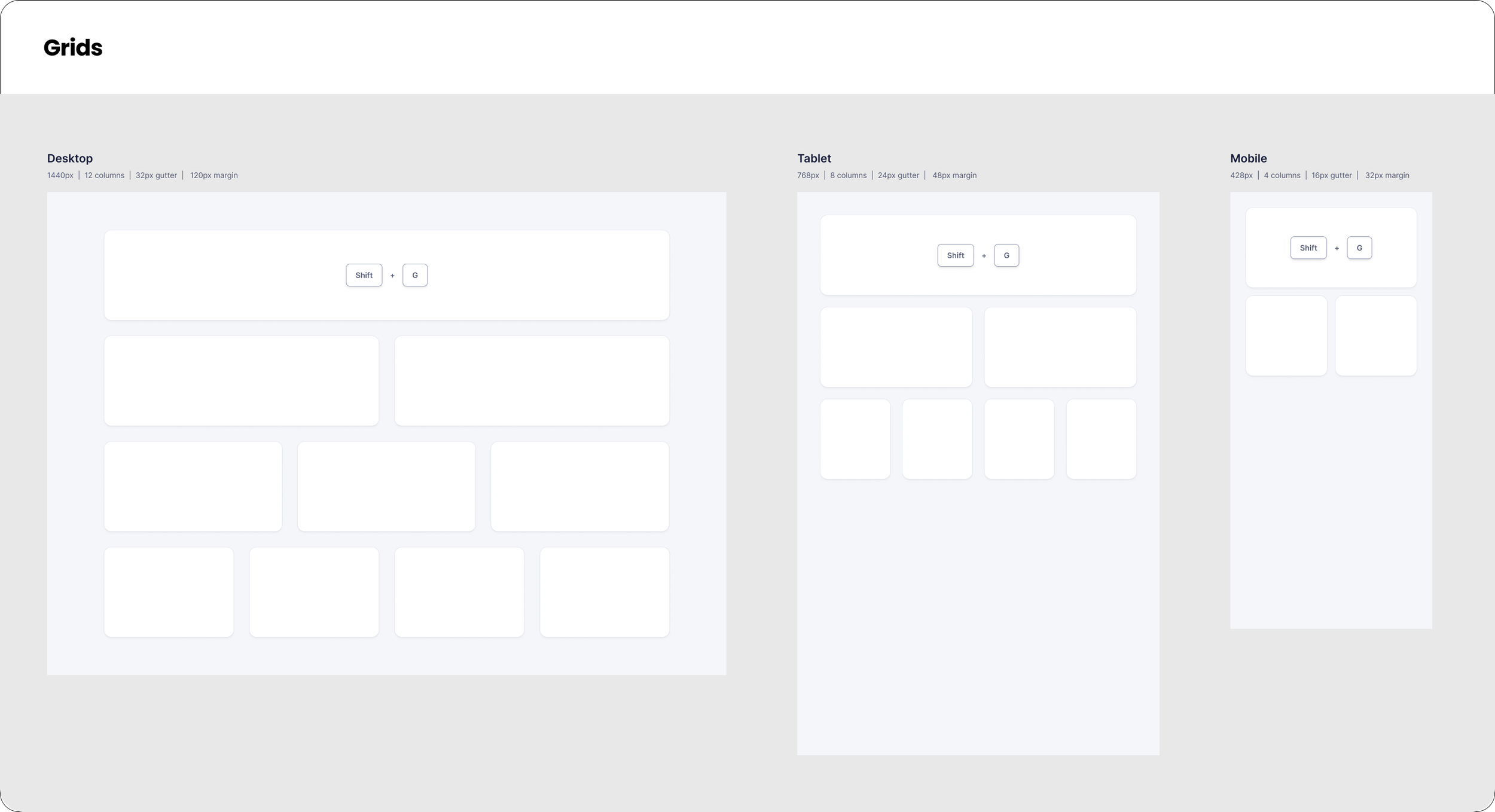
Design System
The previous site did not have a design system, so I created one for the owner to have for reference, as well as share these components with the developer.
Hi-fi Prototyping in Figma
The following section features captions describing reasoning for design decisions, changes based on user feedback, and overall improvements in the final version of the prototype.
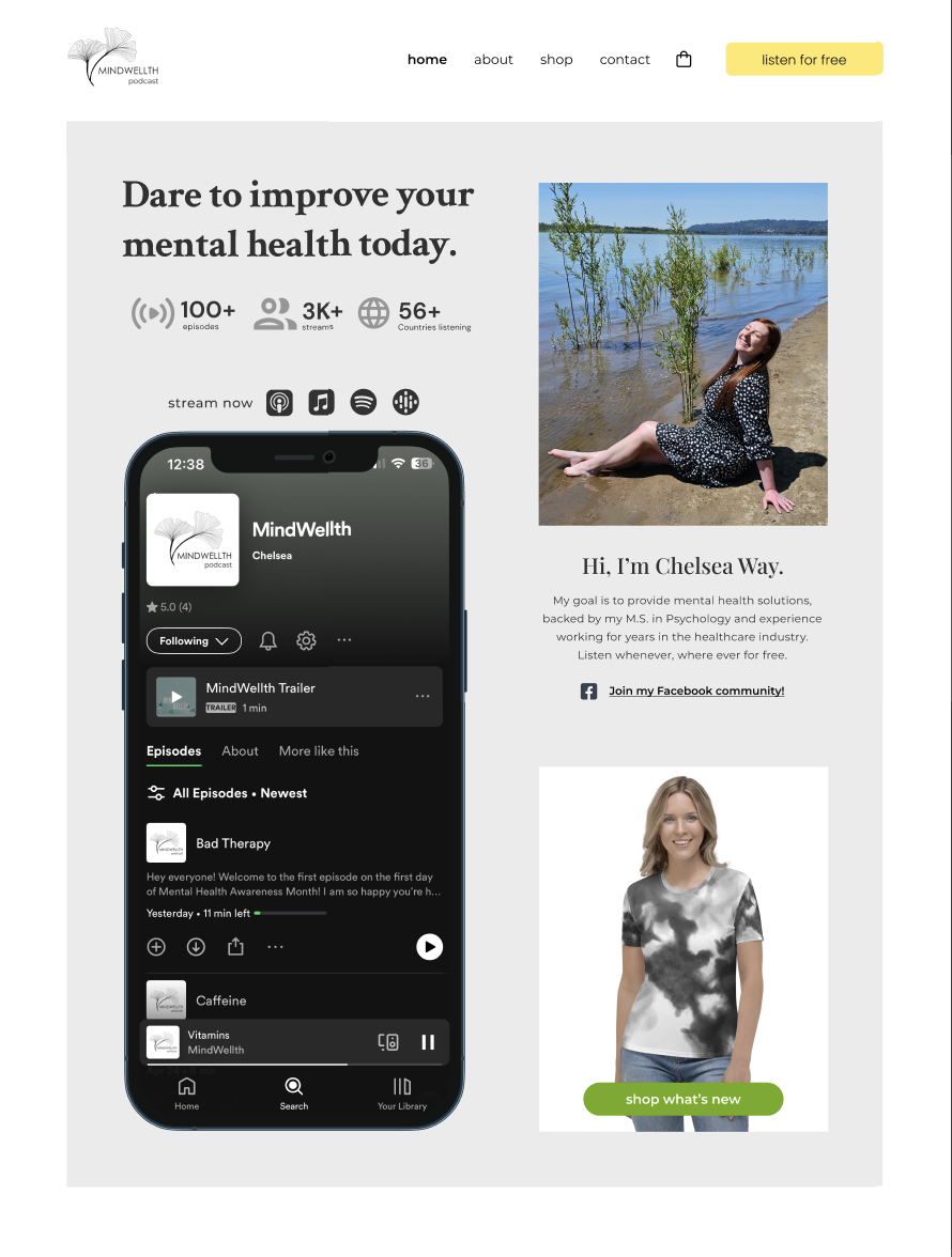
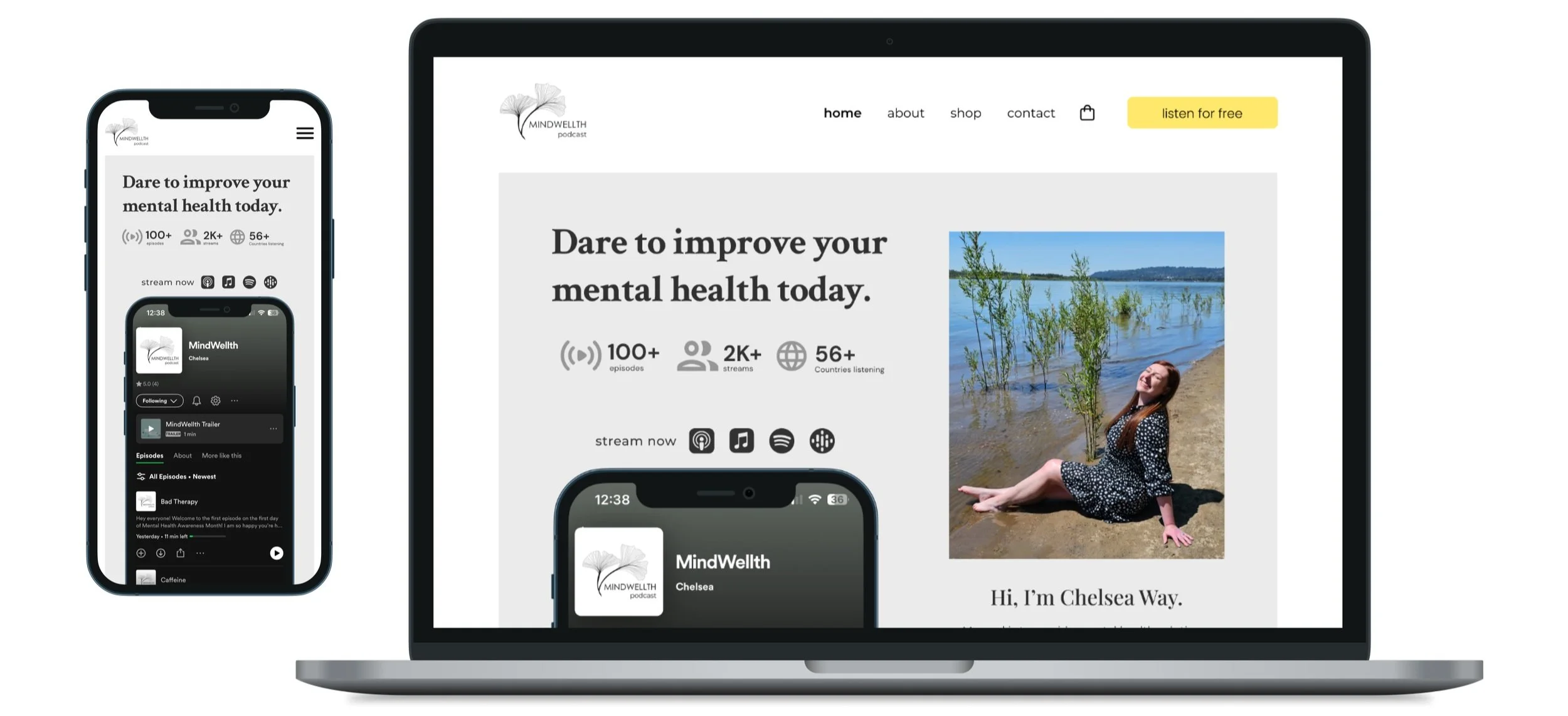
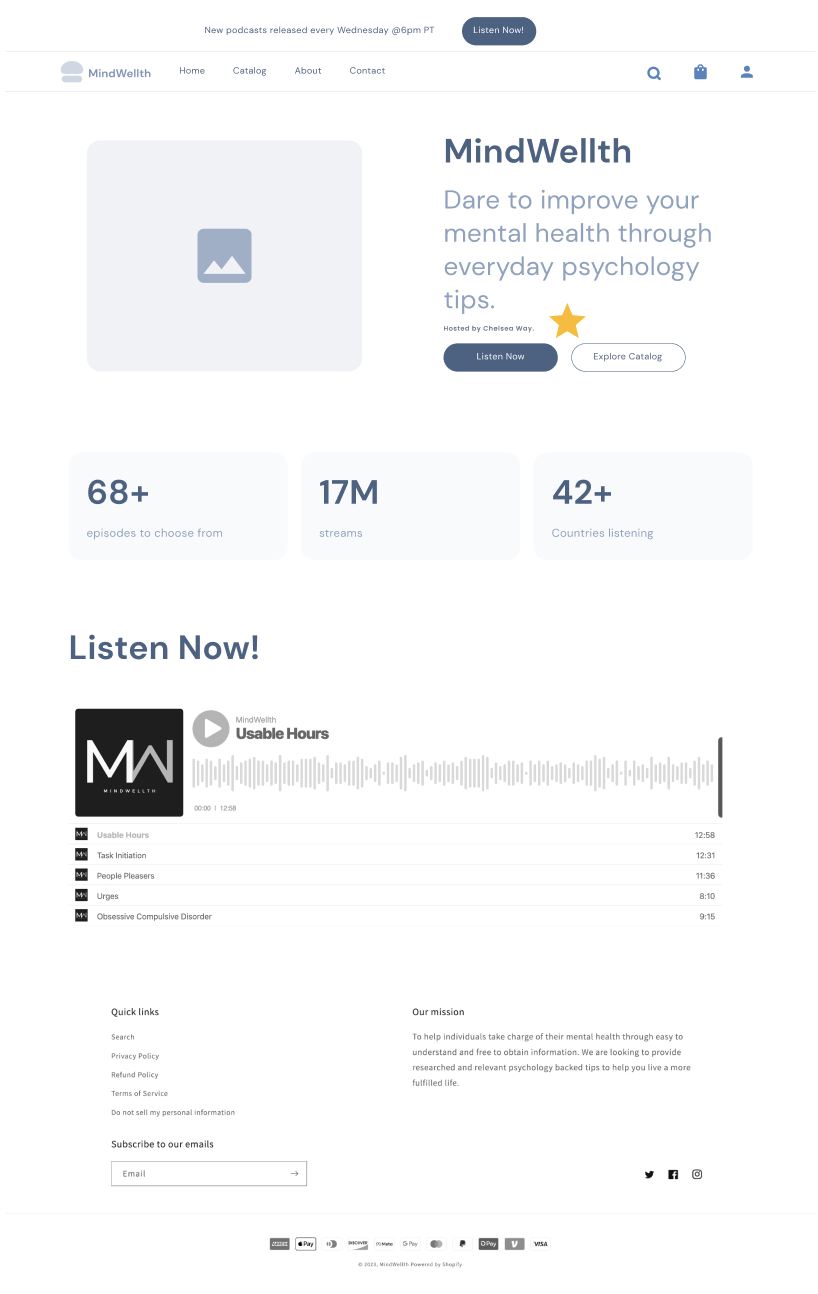
The Z page format for the home page was carefully selected to maximize content and guide users through CTAs.
Z Format Design
Socials CTA
Connecting users to other social media accounts was major client goal. Linking social channels in various ways that were not too redundant was key
Easy listening
Having the podcast audio player built into the website makes it easy for users to quickly jump into streaming an episode.
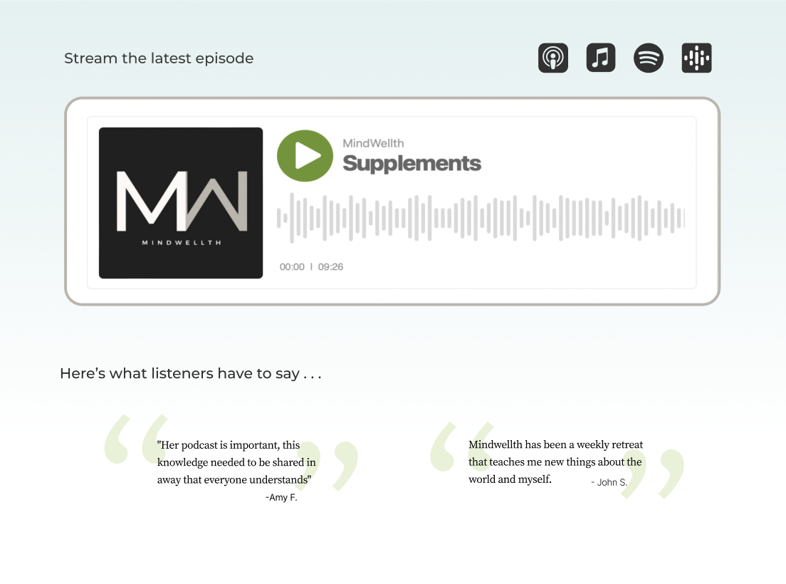
Listener endorsement
Including quotes from real listeners helps to build trust for potential shoppers.
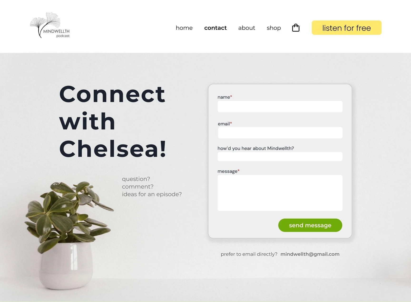
Conversational
The image choice of a plant helps to carry the mission of “growth” throughout the site while utilizing UX writing to help invite the user to contact Chelsea.
Offers alt contact
Some customers prefer a direct email instead in lieu a filling out a form.
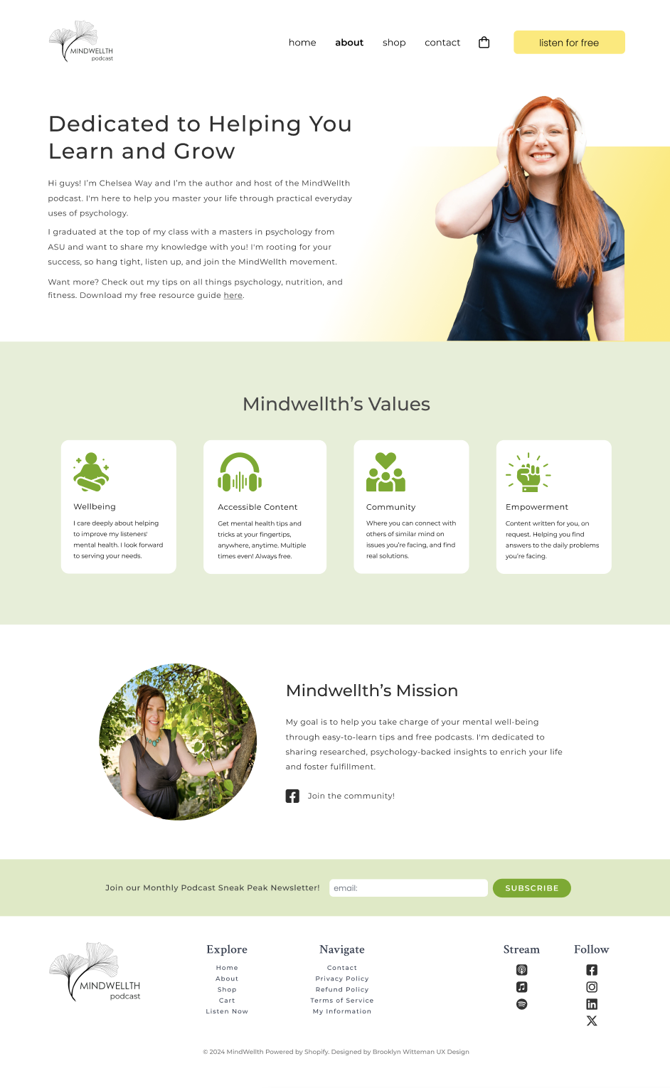
Personal Touches
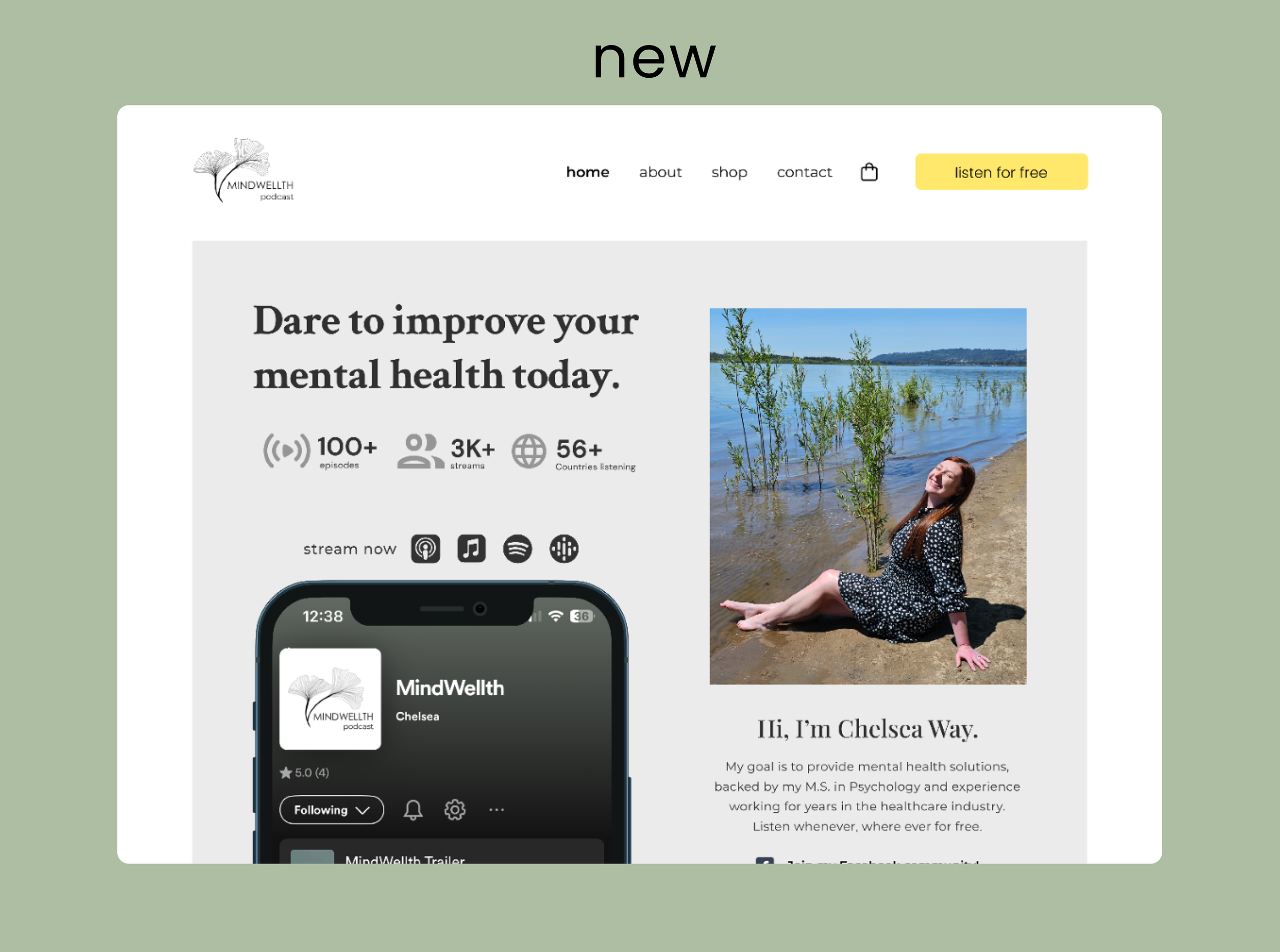
Chelsea was lacking photos of herself on her old site. Pairing font styles, images, and her writing style shows off her character.
Socials linked
socials are tagged throughout the website to help circulate traffic back to content
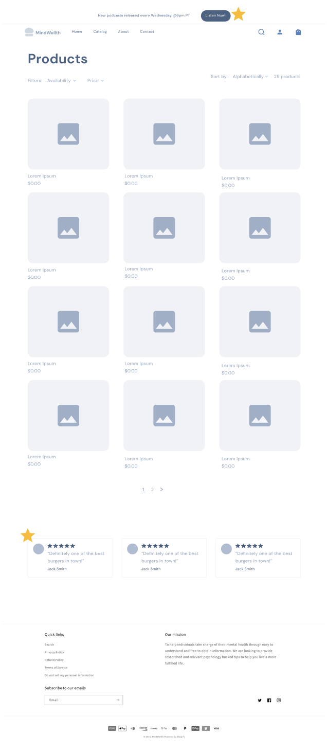
Clear values
Visitors can quickly identify the values through visuals paired with written info.
Community
I created this image in photoshop to help foster a sense of community, while also showcasing merchandise
Credibility & trust
Customer reviews were added to help build trust in products
Info Hierarchy
Shopify has a robust e-commerce platform built into it. I focused on integrating the design system to have consistency and branding across the site.
User Testing
A/B Testing: Shopify website vs. Prototype
I conducted testing with 3 listeners of the podcast who have also purchased merchandise. All sessions utilized the think-aloud method and a survey. First users navigated the old website and shared feedback verbally about the design, followed by targeted questions. Then, users tested the prototype in Figma, repeating the same process. Lastly, users completed a survey that included an NPS score, site rating, and written feedback.

Shopify Website Findings
The shop competed with the podcast on the hero page - confused users what the main focus of site is.
The background image of the hero page had contrast ratio issues. One user said the website design was “cold”.
Visitors liked that you could stream the podcast on the home page.
Users stated the site is “short and sweet” & “easy to read”.
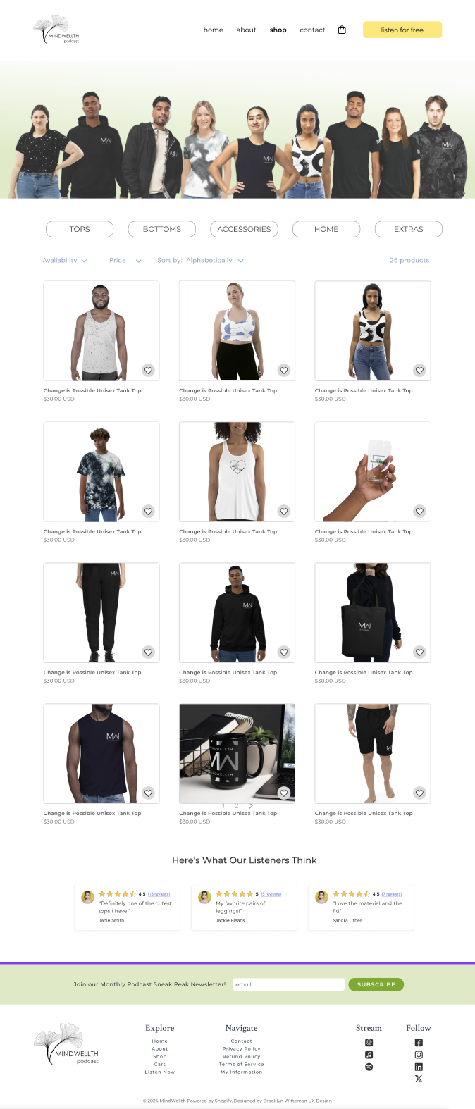
The word “extras” in the shop section doesn’t make sense.
Users had issues with the incorrect color on window devices and strange. See fig 1 below.
Confusion about of email newsletter content
Shopping and check out is easy on the website.
Users said prototype was “more ergonomic”, “night and day” difference, and a “dramatic improvement.”
Color choices preferred “more inviting” and “outgoing”.
Visitors liked the CTA buttons ie. “Listen Now” or “Shop All”.
Reviews on catalogue page added value and credibility for shoppers.
Adding emoticons instead of hashtags to the blog was also an idea that was discusses.
Users agreed that “Accessories” or “Home” is a better category title than “Extras”.
Adding Resource Guide and Mission Statement to the About page was valuable to users.
Figma Prototype Findings
Design Handoff
Upon completion of user testing and evaluation, I shared the findings with the business owner. I confirmed with the business owner that she could proceed with design implementation with the web developer. I also let them know that I labeled the design items, i.e., files, layers, components, groups, etc., based upon cross-functional team naming convention industry standards. The developer implemented my Figma design as best as they could into Wordpress.
Key Takeaways & Recommendations
New site focused more on Chelsea’s personality and connected back to the podcast making the site purpose and user journey more intuitive.
1.
Unanimously stated that the new site was a dramatic improvement overall in both design and accessibility. This claim is supported by the NPS boost of 70% to 96.6%
2.
Users like the clear CTA buttons and noted the site was easier to navigate the podcasts, listen, and share.
3.
In future iterations, adding a pop up to stream the podcast would be ideal to make listening easy, while not interrupting site navigation.
4.
Thanks for Reading!